Apple Dylan Screenshots
Paul R Potts writes:
The Configurable Browser
At the heart of the Apple Dylan TR was the extremely configurable multi-pane browser window. Panes could be arranged and split arbitrarily, and the “output” of any pane could be dragged and dropped onto the input of another. This meant that the selected object in the source pane would be displayed in a detailed view in the destination pane. In this example note how four browser panes are linked together to “drill down” to the function level. The little icons unobtrusively indicate the type of each entity in the browser: a class definition, function, slot, etc. Little colored squares in the margin indicate unsaved objects, warnings, and other properties of the source code records.
This also illustrates a key feature of the Apple Dylan TR: every part of your source code was not just text in a text file, it was a separate object in an object database. This gave the IDE incredible power, because meta-data about each object could be maintained to facilitate browsing via a variety of relationships and views, but less-than-optimal implementation may have been responsible for some of the performance problems of the Technology Release.
Certain other IDEs have also used this technique: for example, IBM’s VisualAge tools use a repository, and even included a complete source-code version tracking system. This greatly facilitates activities like code refactoring.
Keeping your source code in a fully version-tracked, object-oriented database with full metadata is an idea whose time has long since arrived, yet most of us still spend our time editing text files. Apple Dylan could export and import code from text files, but once you’ve used an IDE that takes advantage of fine-grained object storage of your source, you’ll never want to go back.
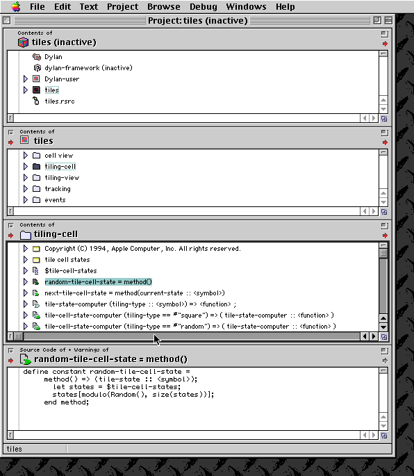
Browser panes of Apple Dylan Environment.
Here is a differently-configured browser showing how to “drill down” to display a class definition.
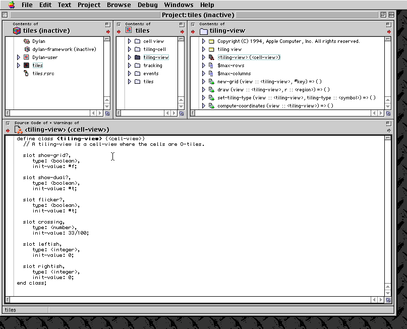
The Apple Dylan browser drilling down to a class definition.
It was also possible to view an entire nested hierarchy in a single pane, using the little “disclosure triangles” to collapse and expand parts of the hierarchy. Here is an example. Note that there were sometimes cosmetic drawing problems in the browsers; keep in mind that the Dylan TR was not a finished product, and Apple was quite open about the fact that it had some rough edges.
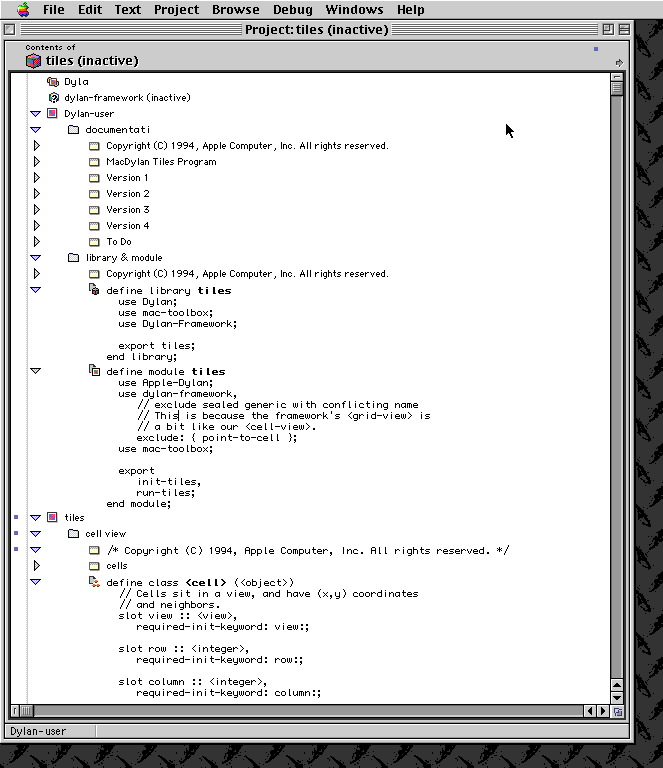
Hierarchy of Apple Dylan.
Rather than display warnings and errors in a separate log window, a legacy of separate text-file based compilers, Apple Dylan could use configurable colored dots to indicate the source entities that contained problems. It was possible to leave some problems to fix later, as long as they were not critical errors and as long as the source entity containing the problem was not needed to satisfy a dependency in the code.
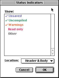
Status indicator of Apple Dylan.
Here is a browser window showing how warnings could be displayed inline with the code. Note that the status indicators propagate up even to the top of the browser, to indicate that somewhere in this browser are warnings. Apple Dylan’s UI was designed from the ground up to allow developers to work in multiple views of the code at once.
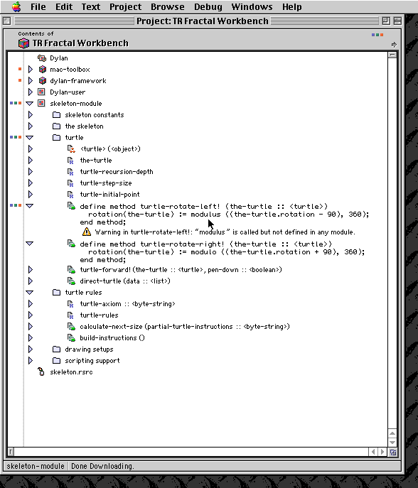
Warnings of Apple Dylan.
In addition to letting you configure your own browser, the Dylan TR provided a number of pre-defined browsers with special behaviors that could give a particular view of the entities hooked into them. On the next page, Apple Dylan Screenshots - Browsers, you can see some of these browsers.